ASK a doubt

BYJUS

AUGUST 2021

Overview

Ask a Doubt forms part and parcel of the BYJU'S app, a feature developed to satisfy more than 75 million users in simplifying the way a student seeks or gets academic help.

The feature was initiated to boost user interaction and further the cause of academics with ease; students just have to upload images of questions that they have and then get quick, accurate answers. It integrates OCR and AI for immense reductions in search time.

My Role

Product Designer — UX Research, Visual Design, Rapid Prototyping

Timeline

3 months, Updated as of Oct 2021. Live link

Team

Sooraj Premkumar, Design Manager
Nitin, Visual Designer

UI SCREENS

ICONOGRAPHY

MOTION

MOTION

STORYBOOK

STORYBOOK

HIGHLIGHTS

The story behind building a scalable, user-friendly feature for

instant academic support

INTRODUCTION

Improving educational engagement with Ask a Doubt

Fig 1. GIF

Seamlessly bridging questions to answers

Imagine a student working on their homework. What do they do when they're stuck on a question and need the solution? The obvious response would be to use Google, right? We helped Byju's users search for their question in the app and get a definitive answer, along with the specific chapter and topic in the book.


It lets students click photographs of their academic questions (Fig 1) and assists them with accurate, instant answers through advanced OCR technology. To achieve this, the designing process went through continuous cycles of immediate user response and iterative testing to make the feature powerful, yet easy to use for proactive and empowered learning.

PROBLEM

Addressing inefficiencies in student query resolution

Identifying barriers to rapid and effective learning


It had become clear, through feedback from users—via app store reviews and direct interaction with students and mentors (Fig 1)—that current search functionalities fell short of meeting students' needs and thus providing fast and accurate answers.


Additionally, our product and business teams identified the enhancement of customer satisfaction and engagement scores as a primary objective for the app's continuous improvement. This set the stage for developing a solution that could transform the user experience by making information discovery as seamless as possible.

Students face lengthy delays as they navigate complex search interfaces, which detracts from valuable study time.

Current tools do not offer tailored help, making it difficult for students to address personal learning gaps.

Inefficient and slow resolution of queries can lead to decreased motivation and engagement among students.

Poor response mechanisms have resulted in low user satisfaction and, therefore, low usage of the educational platform.

Fig 1. IMAGE

GOAL

Setting strategic goals with the DVF framework

Fig 1. IMAGE

How did we define our main goals in the first place?

The DVF framework (Fig. 1) helped us compare ideas and set clear, actionable goals for the new feature by balancing user needs, business priorities, and technical feasibility.

From there, we turned those ideas into concrete goals with measurable metrics, so we could track the feature’s performance, make sure it stays aligned with our business strategy, and keep users happy.


We narrowed it down to three main priorities needed to kickstart this project:

Improve learning experiences

Utilize AI and OCR to offer correct responses, helping students to overcome individual learning challenges.

Reduce search time

Reducing the number of steps involved between someone having a question and finding the answer.

Feedback Integration

Incorporate mechanisms for users to provide feedback on answers, which can be used to continuously improve the accuracy and helpfulness of responses.

IMPACT

Transforming learning dynamics with immediate feedback

Fig 1. IMAGE

Measurable outcomes from enhanced student interactions

Data collected after the launch (Fig 1) showed a 40% increase in the users of the app, showing quite noticeably the sudden increase in interaction of students and their dependency on the feature for academic assistance.


More importantly, the feature led to the major outcome of seriously improving the comprehension of complex topics by these students. This was reflected in the 37.5% reduction in search time. Further, this feature dramatically improved our usability scores of the app: ease and speed of finding the correct answer were among the top benefits described in user feedback.

USER RESEARCH

Diving into user stories

Insights captured from real users

Hearing directly from students made all the difference. By talking to them in interviews and running surveys, we got a clear picture of how they interact with educational content and what they really need.


What we found was pretty consistent: students care about speed and accuracy, especially when they're deep in their homework or studying for exams

Fig 1. EMPATHY MAP

Unlocking insights with empathy

By examining their frustrations, unspoken anxieties, and behavior patterns, we pinpointed key pain points, such as the need for quicker responses and more interactive ways to engage with learning content.

Fig 2. USER INTERVIEW NOTES

Fig 3. USER INTERVIEW NOTES

Interview notes from the users

These conversations revealed that students have specific needs and preferences at different stages of their learning—whether they’re trying to understand new concepts, complete homework, or prepare for exams. Each phase calls for different kinds of support, from in-depth exploration of complex topics to quick, focused reviews before a test.

ABOUT THE USER

User goals and pain points

Solving key challenges for better study results


In talking to students like John Doe. We’ve learned a lot about what they really need—and what’s been holding them back.

John's main goal is simple: he wants to boost his scores, get real-time help when he’s stuck, and deepen his understanding of tricky subjects. But, like many students, he runs into some major roadblocks: delayed answers, confusing navigation in the app, and not having a tutor available when he needs one the most.

Fig 1. IMAGE

Fig 2. IMAGE

COMPETITOR ANALYSIS

How do me make this feature stand out in Ed-Tech

Fig 1. IMAGE

Outpacing them with fast, tailored solutions

We studied apps like Brainly, Triplens, and Photomath (Fig 1)—popular tools that students already use to get quick academic help. . But we wanted to dive deeper into how they work, how user-friendly they are, and how satisfied their users actually feel. What we found helped us pinpoint areas where BYJU'S could do things better—and smarter.


One thing became clear: many of these apps either give too broad or too slow responses. We focused on making sure students get fast, precise answers that really match what they're asking. For example, Photomath is great for math problems you can snap a photo of, but it's pretty limited to just numbers and equations.

EARLY IDEATION

Visualizing how students engage and navigate

Fig 1. IMAGE

Ideation 1: initial concept and interface design

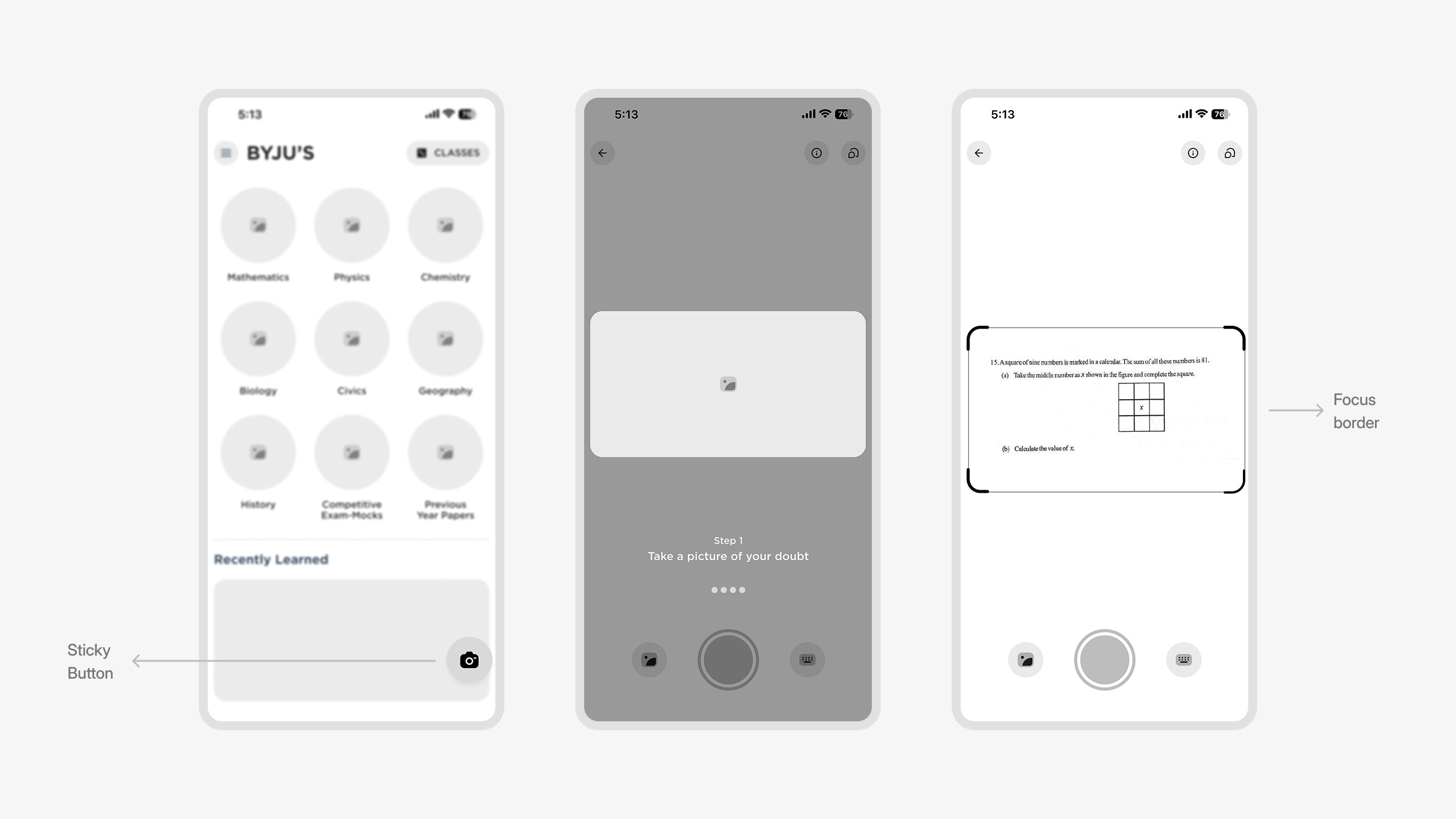
Non-Fixed Button

The button's non-static placement on the homepage made it hard to access, especially during scrolling.

Lack of Instructions

No guidance was provided on how to effectively use the query feature, leading to potential confusion.

No Typing Option

The initial version didn't allow for typed queries, limiting user flexibility to only image-based inputs.

Fig 2. IMAGE

Ideation 2: Enhancing usability and accessibility

Fixed Button

The query button became permanently visible on the screen, ensuring easy access even while scrolling through content.

Enhanced Instructions

We included explicit instructions in the app’s camera interface and FTUE modals to guide users, reducing confusion.

Typing Option

By allowing students to type questions, we provided a more flexible solution, accommodating users who prefer text-based inputs or don’t have a photo ready.

Rapid iterations and feedback

This approach let us quickly spot and fix usability issues. We kept testing and tweaking the design—things like stabilizing the query button and making the user instructions clearer—so we could improve the feature’s accessibility and overall functionality till we reach our final screens.

FINAL DESIGNS

Problem-solving literally at your fingertips

Fig 1. IMAGE

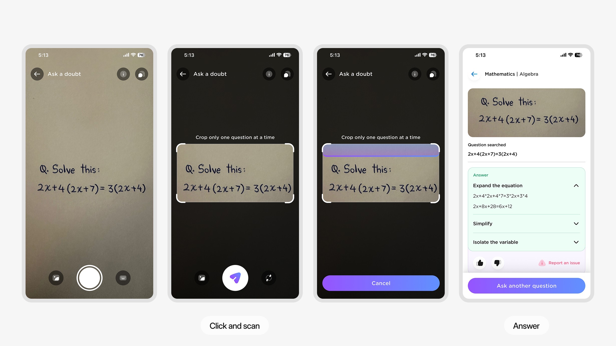
Providing on the spot answers

The feature quickly analyzes the problem and gives a detailed breakdown of the steps needed to solve it. Having instant access to these guided solutions helps students understand the material better and supports self-paced learning, making it a great tool for their educational journey

Fig 2. IMAGE

User feedback back into the user experience

User testing showed that students were a bit confused at first when using our new query feature, so we introduced a First-Time User Experience (FTUE) (Fig 2) to help. The FTUE walks them through the steps to use this feature.

We also promoted independent problem-solving by encouraging students to try answering the questions on their own or see the first step before checking the whole solutions. This method helps build confidence and improves learning retention by guiding users to work through the solutions step-by-step.

Fig 3. IMAGE

But what if my camera doesn't work?

To address OCR limitations, we've updated our app so users can manually type in their queries and choose specific tags and subjects like "Thermodynamics" or "Chemical Reactions" (Fig 3).

This dual-input system caters to different user preferences while improving accuracy and relevance, making sure each student gets the exact support they need. It’s a change aimed at boosting user satisfaction and accessibility overall.

Fig 4. IMAGE

User-driven content refinement heading

After viewing answers, users can rate the solution with a thumbs-up or thumbs-down, helping us refine content and make system updates continuously. This feature lets users play an active role in improving the accuracy and relevance of the app, which in turn boosts its reliability.

If a solution is incorrect or incomplete, users can use the "Report an Issue" option to flag specific problems. This feedback directly impacts updates, ensuring the content stays accurate and reliable, building trust and creating a more dynamic learning experience.

Fig 5. IMAGE

Connecting with experts via live tutor support

This option appears immediately after automated solutions are shown, giving students the chance to connect with experts if they need more clarification (Fig 5).

By combining the accuracy of algorithms with personalized, expert guidance, this feature boosts user engagement, making sure every student's learning experience is backed by both technology and human support.

Future steps

Live video tutoring

Enable live video chats for instant, face-to-face tutoring, boosting engagement and support.

Multi-language support

Expand to support multiple languages, increasing accessibility for a global audience.

Advancement in AI

Leverage AI for personalized feedback, real-time tracking, and adaptive learning recommendations.

Reflecting on the journey

Looking back

This was one of the earliest projects I worked on when I started my full-time job, and I really enjoyed it. What I learned from this is:

Agile methodology

Adopted Agile practices to boost flexibility and responsiveness, enabling quick adjustments based on user feedback and changing project needs.

Data-driven decision making

Utilized user data more effectively to make informed design and feature enhancements.

Technological integration

Gained insights into the complexities of integrating advanced technologies like AI and live chat.

ASK a doubt

BYJUS

AUGUST 2021

Overview

Ask a Doubt forms part and parcel of the BYJU'S app, a feature developed to satisfy more than 75 million users in simplifying the way a student seeks or gets academic help. The feature was initiated to boost user interaction and further the cause of academics with ease; students just have to upload images of questions that they have and then get quick, accurate answers. It integrates OCR and AI for immense reductions in search time.

My Role

Product Designer — UX Research, Visual Design, Rapid Prototyping

Timeline

3 months, Updated as of October 2021. Live link

Team

Sooraj Premkumar, Design Manager

Nitin, Visual Designer

The story behind building a scalable, user-friendly feature for

instant academic support

HIGHLIGHTS

INTRODUCTION

Improving educational engagement with "Ask a Doubt"

Seamlessly bridging questions to answers

Imagine a student working on their homework. What do they do when they're stuck on a question and need the solution? The obvious response would be to use Google, right? We helped Byju's users search for their question in the app and get a definitive answer, along with the specific chapter and topic in the book.

It lets students click photographs of their academic questions and assists them with accurate, instant answers through advanced OCR technology. To achieve this, the designing process went through continuous cycles of immediate user response and iterative testing to make the feature powerful, yet easy to use for proactive and empowered learning.

PROBLEM

Addressing inefficiencies in student query resolution

Identifying barriers to rapid and effective learning

It had become clear, through feedback from users—via app store reviews and direct interaction with students and mentors—that current search functionalities fell short of meeting students' needs and thus providing fast and accurate answers.

Additionally, our product and business teams identified the enhancement of customer satisfaction and engagement scores as a primary objective for the app's continuous improvement. This set the stage for developing a solution that could transform the user experience by making information discovery as seamless as possible.

Students face lengthy delays as they navigate complex search interfaces, which detracts from valuable study time.

Standard search tools often return general answers that fail to address the specific nuances of students' questions.

Inefficient and slow resolution of queries can lead to decreased motivation and engagement among students.

The need for rapid answers is critical in maintaining the flow of learning, especially in fast-paced educational settings.

GOAL

Setting strategic goals with the DVF framework

How did we define our main goals in the first place?

The DVF framework (Fig. 1) helped us compare ideas and set clear, actionable goals for the new feature by balancing user needs, business priorities, and technical feasibility.

From there, we turned those ideas into concrete goals with measurable metrics, so we could track the feature’s performance, make sure it stays aligned with our business strategy, and keep users happy.

We narrowed it down to three main priorities needed to kickstart this project:

Improve learning experiences

Utilize AI and OCR to offer correct responses, helping students to overcome individual learning challenges.

Reduce search time

Reducing the number of steps involved between someone having a question and finding the answer, learning can be considerably sped up.

Feedback Integration

Incorporate mechanisms for users to provide feedback on answers, which can be used to continuously improve the accuracy and helpfulness of responses.

USER RESEARCH

Diving into user stories

Insights captured from real users

Hearing directly from students made all the difference. By talking to them in interviews and running surveys, we got a clear picture of how they interact with educational content and what they really need.


What we found was pretty consistent: students care about speed and accuracy, especially when they're deep in their homework or studying for exams

Unlocking insights with empathy

By examining their frustrations, unspoken anxieties, and behavior patterns, we pinpointed key pain points, such as the need for quicker responses and more interactive ways to engage with learning content.

Interview notes from the users

These conversations revealed that students have specific needs and preferences at different stages of their learning—whether they’re trying to understand new concepts, complete homework, or prepare for exams. Each phase calls for different kinds of support, from in-depth exploration of complex topics to quick, focused reviews before a test.

COMPETITOR ANALYSIS

How do me make this feature stand out in Ed-Tech

Outpacing them with fast, tailored solutions

We studied apps like Brainly, Triplens, and Photomath—popular tools that students already use to get quick academic help. . But we wanted to dive deeper into how they work, how user-friendly they are, and how satisfied their users actually feel. What we found helped us pinpoint areas where BYJU'S could do things better—and smarter.

One thing became clear: many of these apps either give too broad or too slow responses. We focused on making sure students get fast, precise answers that really match what they're asking. For example, Photomath is great for math problems you can snap a photo of, but it's pretty limited to just numbers and equations.

Reflecting on the journey

Looking back

This was one of the earliest projects I worked on when I started my full-time job, and I really enjoyed it. What I learned from this is:

Agile methodology

Adopted Agile practices to boost flexibility and responsiveness, enabling quick adjustments based on user feedback and changing project needs.

Data-driven decision making

Utilized user data more effectively to make informed design and feature enhancements.

Technological integration

Gained insights into the complexities of integrating advanced technologies like AI and live chat.

IMPACT

Transforming learning dynamics with immediate feedback

Measurable outcomes from enhanced student interactions

Data collected after the launch (Fig 1) showed a 40% increase in the users of the app, showing quite noticeably the sudden increase in interaction of students and their dependency on the feature for academic assistance.

More importantly, the feature led to the major outcome of seriously improving the comprehension of complex topics by these students. This was reflected in the 37.5% reduction in search time. Further, this feature dramatically improved our usability scores of the app: ease and speed of finding the correct answer were among the top benefits described in user feedback.

ABOUT THE USER

User goals and pain points

Solving key challenges for better study results

In talking to students like John Doe. We’ve learned a lot about what they really need—and what’s been holding them back.

John's main goal is simple: he wants to boost his scores, get real-time help when he’s stuck, and deepen his understanding of tricky subjects. But, like many students, he runs into some major roadblocks: delayed answers, confusing navigation in the app, and not having a tutor available when he needs one the most.

EARLY IDEATION

Visualizing how students engage and navigate

Non-Fixed Button

The button's non-static placement on the homepage made it hard to access, especially during scrolling.

Lack of Instructions

No guidance was provided on how to effectively use the query feature, leading to potential confusion.

No Typing Option

The initial version didn't allow for typed queries, limiting user flexibility to only image-based inputs.

Fixed Button

The query button became permanently visible on the screen, ensuring easy access even while scrolling through content.

Enhanced Instructions

We included explicit instructions in the app’s camera interface and FTUE modals to guide users, reducing confusion.

Typing Option

By allowing students to type questions, we provided a more flexible solution, accommodating users who prefer text-based inputs or don’t have a photo ready.

Ideation 1: Initial concept and interface design

Ideation 2: Enhancing usability and accessibility

Rapid iterations and feedback

This approach let us quickly spot and fix usability issues. We kept testing and tweaking the design—things like stabilizing the query button and making the user instructions clearer—so we could improve the feature’s accessibility and overall functionality till we reach our final screens.

FINAL DESIGNS

Problem-solving literally at your fingertips

Providing on the spot answers

The feature quickly analyzes the problem and gives a detailed breakdown of the steps needed to solve it. Having instant access to these guided solutions helps students understand the material better and supports self-paced learning, making it a great tool for their educational journey

User feedback back into the user experience

User testing showed that students were a bit confused at first when using our new query feature, so we introduced a First-Time User Experience (FTUE) to help. The FTUE walks them through the steps to use this feature.


We also promoted independent problem-solving by encouraging students to try answering the questions on their own or see the first step before checking the whole solutions. This method helps build confidence and improves learning retention by guiding users to work through the solutions step-by-step.

But what if my camera doesn't work?

To address OCR limitations, we've updated our app so users can manually type in their queries and choose specific tags and subjects like "Thermodynamics" or "Chemical Reactions."

This dual-input system caters to different user preferences while improving accuracy and relevance, making sure each student gets the exact support they need. It’s a change aimed at boosting user satisfaction and accessibility overall.

User-driven content refinement heading

After viewing answers, users can rate the solution with a thumbs-up or thumbs-down, helping us refine content and make system updates continuously. This feature lets users play an active role in improving the accuracy and relevance of the app, which in turn boosts its reliability.

If a solution is incorrect or incomplete, users can use the "Report an Issue" option to flag specific problems. This feedback directly impacts updates, ensuring the content stays accurate and reliable, building trust and creating a more dynamic learning experience.

Connecting with experts via live tutor support

This option appears immediately after automated solutions are shown, giving students the chance to connect with experts if they need more clarification.

By combining the accuracy of algorithms with personalized, expert guidance, this feature boosts user engagement, making sure every student's learning experience is backed by both technology and human support.

Live video tutoring

Enable live video chats for instant, face-to-face tutoring, boosting engagement and support.

Multi-language support

Expand to support multiple languages, increasing accessibility for a global audience.

Advancement in AI

Leverage AI for personalized feedback, real-time tracking, and adaptive learning recommendations.

Future steps

ASK a doubt

BYJUS

AUGUST 2021

Overview

Ask a Doubt forms part and parcel of the BYJU'S app, a feature developed to satisfy more than 75 million users in simplifying the way a student seeks or gets academic help.

The feature was initiated to boost user interaction and further the cause of academics with ease; students just have to upload images of questions that they have and then get quick, accurate answers. It integrates OCR and AI for immense reductions in search time.

My Role

Product Designer — UX Research, Visual Design, Rapid Prototyping

Timeline

3 months, Updated as of October 2021. Live link

Team

Sooraj Premkumar, Design Manager
Nitin, Visual Designer

The story behind building a scalable, user-friendly feature for instant academic support

HIGHLIGHTS

INTRODUCTION

Improving educational engagement with "Ask a Doubt"

Seamlessly bridging questions to answers

Imagine a student working on their homework. What do they do when they're stuck on a question and need the solution? The obvious response would be to use Google, right? We helped Byju's users search for their question in the app and get a definitive answer, along with the specific chapter and topic in the book.

It lets students click photographs of their academic questions and assists them with accurate, instant answers through advanced OCR technology. To achieve this, the designing process went through continuous cycles of immediate user response and iterative testing to make the feature powerful, yet easy to use for proactive and empowered learning.

PROBLEM

Addressing inefficiencies in student query resolution

Identifying barriers to rapid and effective learning

It had become clear, through feedback from users—via app store reviews and direct interaction with students and mentors—that current search functionalities fell short of meeting students' needs and thus providing fast and accurate answers.

Additionally, our product and business teams identified the enhancement of customer satisfaction and engagement scores as a primary objective for the app's continuous improvement. This set the stage for developing a solution that could transform the user experience by making information discovery as seamless as possible.

Students face lengthy delays as they navigate complex search interfaces, which detracts from valuable study time.

Standard search tools often return general answers that fail to address the specific nuances of students' questions.

Inefficient and slow resolution of queries can lead to decreased motivation and engagement among students.

The need for rapid answers is critical in maintaining the flow of learning, especially in fast-paced educational settings.

GOAL

Setting strategic goals with the DVF framework

How did we define our main goals in the first place?

The DVF framework (Fig. 1) helped us compare ideas and set clear, actionable goals for the new feature by balancing user needs, business priorities, and technical feasibility.

From there, we turned those ideas into concrete goals with measurable metrics, so we could track the feature’s performance, make sure it stays aligned with our business strategy, and keep users happy.

We narrowed it down to three main priorities needed to kickstart this project:

We narrowed it down to three main priorities needed to kickstart this project:

Improve learning experiences

Utilize AI and OCR to offer correct responses, helping students to overcome individual learning challenges.

Reduce search time

Reducing the number of steps involved between someone having a question and finding the answer, learning can be considerably sped up.

Feedback Integration

Incorporate mechanisms for users to provide feedback on answers, which can be used to continuously improve the accuracy and helpfulness of responses.

IMPACT

Transforming learning dynamics with immediate feedback

Measurable outcomes from enhanced student interactions

Data collected after the launch (Fig 1) showed a 40% increase in the users of the app, showing quite noticeably the sudden increase in interaction of students and their dependency on the feature for academic assistance.

More importantly, the feature led to the major outcome of seriously improving the comprehension of complex topics by these students. This was reflected in the 37.5% reduction in search time. Further, this feature dramatically improved our usability scores of the app: ease and speed of finding the correct answer were among the top benefits described in user feedback.

USER RESEARCH

Diving into user stories

Insights captured from real users

Hearing directly from students made all the difference. By talking to them in interviews and running surveys, we got a clear picture of how they interact with educational content and what they really need.


What we found was pretty consistent: students care about speed and accuracy, especially when they're deep in their homework or studying for exams

Unlocking insights with empathy

By examining their frustrations, unspoken anxieties, and behavior patterns, we pinpointed key pain points, such as the need for quicker responses and more interactive ways to engage with learning content.

Interview notes from the users

These conversations revealed that students have specific needs and preferences at different stages of their learning—whether they’re trying to understand new concepts, complete homework, or prepare for exams. Each phase calls for different kinds of support, from in-depth exploration of complex topics to quick, focused reviews before a test.

Lorem ipsum dolor sit amet,

When I first joined the EdPlus team as a UX designer focused on design systems, we were working with components that had been imported from Adobe XD. But when these elements were brought into Figma, the transition didn’t always go smoothly.


I streamlined our workflow and improved the alignment between design and development.

COMPETITOR ANALYSIS

How do me make this feature stand out in Ed-Tech

Lorem ipsum dolor sit amet,

When I first joined the EdPlus team as a UX designer focused on design systems, we were working with components that had been imported from Adobe XD. But when these elements were brought into Figma, the transition didn’t always go smoothly.


I streamlined our workflow and improved the alignment between design and development.

Outpacing them with fast, tailored solutions

We studied apps like Brainly, Triplens, and Photomath—popular tools that students already use to get quick academic help. . But we wanted to dive deeper into how they work, how user-friendly they are, and how satisfied their users actually feel. What we found helped us pinpoint areas where BYJU'S could do things better—and smarter.

One thing became clear: many of these apps either give too broad or too slow responses. We focused on making sure students get fast, precise answers that really match what they're asking. For example, Photomath is great for math problems you can snap a photo of, but it's pretty limited to just numbers and equations.

Reflecting on the journey

Looking back

This was one of the earliest projects I worked on when I started my full-time job, and I really enjoyed it. What I learned from this is:

Agile methodology

Adopted Agile practices to boost flexibility and responsiveness, enabling quick adjustments based on user feedback and changing project needs.

Data-driven decision making

Utilized user data more effectively to make informed design and feature enhancements.

Technological integration

Gained insights into the complexities of integrating advanced technologies like AI and live chat.

ABOUT THE USER

User goals and pain points

Solving key challenges for better study results

In talking to students like John Doe. We’ve learned a lot about what they really need—and what’s been holding them back.

John's main goal is simple: he wants to boost his scores, get real-time help when he’s stuck, and deepen his understanding of tricky subjects. But, like many students, he runs into some major roadblocks: delayed answers, confusing navigation in the app, and not having a tutor available when he needs one the most.

EARLY IDEATION

Visualizing how students engage and navigate

Ideation 1: Initial concept and interface design

Non-Fixed Button

The button's non-static placement on the homepage made it hard to access, especially during scrolling.

Lack of Instructions

No guidance was provided on how to effectively use the query feature, leading to potential confusion.

No Typing Option

The initial version didn't allow for typed queries, limiting user flexibility to only image-based inputs.

Ideation 2: Enhancing usability and accessibility

Fixed Button

The query button became permanently visible on the screen, ensuring easy access even while scrolling through content.

Enhanced Instructions

Reducing the number of steps involved between someone having a question and finding the answer, learning can be considerably sped up.

Typing Option

By allowing students to type questions, we provided a more flexible solution, accommodating users who prefer text-based inputs or don’t have a photo ready.

Rapid iterations and feedback

This approach let us quickly spot and fix usability issues. We kept testing and tweaking the design—things like stabilizing the query button and making the user instructions clearer—so we could improve the feature’s accessibility and overall functionality till we reach our final screens.

FINAL DESIGNS

Problem-solving literally at your fingertips

Providing on the spot answers

The feature quickly analyzes the problem and gives a detailed breakdown of the steps needed to solve it. Having instant access to these guided solutions helps students understand the material better and supports self-paced learning, making it a great tool for their educational journey

User feedback back into the user experience

User testing showed that students were a bit confused at first when using our new query feature, so we introduced a First-Time User Experience (FTUE) to help. The FTUE walks them through the steps to use this feature.

We also promoted independent problem-solving by encouraging students to try answering the questions on their own or see the first step before checking the whole solutions. This method helps build confidence and improves learning retention by guiding users to work through the solutions step-by-step.

But what if my camera doesn't work?

To address OCR limitations, we've updated our app so users can manually type in their queries and choose specific tags and subjects like "Thermodynamics" or "Chemical Reactions."

This dual-input system caters to different user preferences while improving accuracy and relevance, making sure each student gets the exact support they need. It’s a change aimed at boosting user satisfaction and accessibility overall.

User-driven content refinement heading

After viewing answers, users can rate the solution with a thumbs-up or thumbs-down, helping us refine content and make system updates continuously. This feature lets users play an active role in improving the accuracy and relevance of the app, which in turn boosts its reliability.

If a solution is incorrect or incomplete, users can use the "Report an Issue" option to flag specific problems. This feedback directly impacts updates, ensuring the content stays accurate and reliable, building trust and creating a more dynamic learning experience.

Connecting with experts via live tutor support

This option appears immediately after automated solutions are shown, giving students the chance to connect with experts if they need more clarification.

By combining the accuracy of algorithms with personalized, expert guidance, this feature boosts user engagement, making sure every student's learning experience is backed by both technology and human support.

Live video tutoring

Enable live video chats for instant, face-to-face tutoring, boosting engagement and support.

Multi-language support

Expand to support multiple languages, increasing accessibility for a global audience.

Advancement in AI

Leverage AI for personalized feedback, real-time tracking, and adaptive learning recommendations.

Future steps

up

up

Made with 💜 & coffee chai. © Gaurav

Made with 💜 & coffee chai. © Gaurav

Made with 💜 & coffee chai. © Gaurav

up