Rocket Design system
EDPLUS
MARCH 2024

Overview
RDS is a centralized design system developed by the product design team for ASU Online to support the diverse and expanding needs of more than 100,000 users.
The main goal of this project was to rebuild and refine a strong design system for our web and mobile applications, focusing on scalability, maintainability, responsiveness, and front-end development.
My Role
Product Designer — Design Systems, Interaction Design, Visual Design, Rapid Prototyping
Timeline
6 months, Updated as of September 2024. Live link
Team
Jeroel Padilla, UX Lead
Patrick Byrn, SWE Lead
Vijayasimhan Ganesan, SWE
Kendall Slaughter, Director of Design and Creative Services

VIDEO

COMPONENTS
COMPONENTS
COMPONENTS
STORYBOOK
HIGHLIGHTS
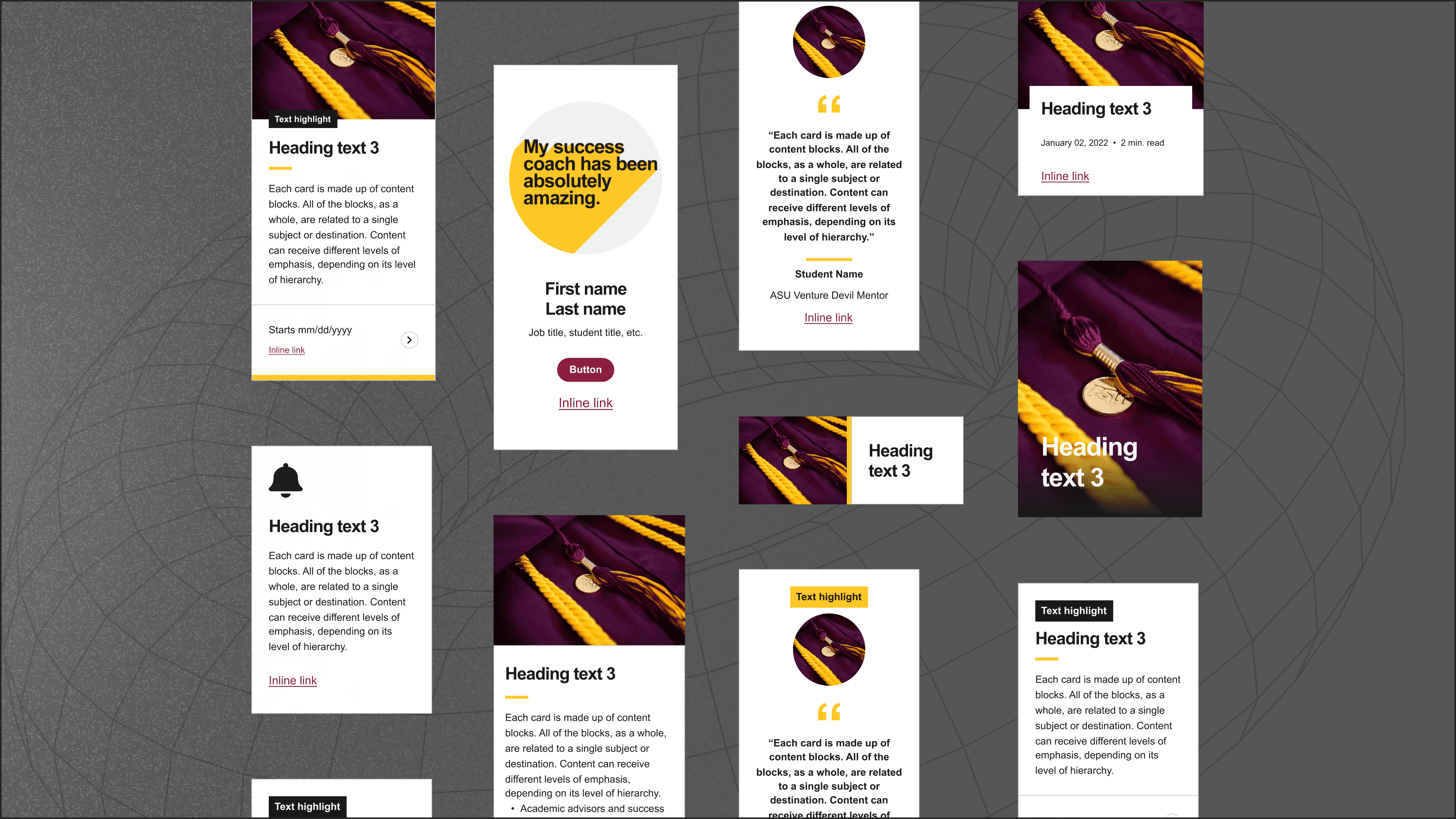
An end-to-end organized, scalable, responsive design system that translates to actual code.
CONTEXT
With multiple dev teams—some in-house, some offshore—our product started feeling disjointed. Developers built pages based on design files, but without a shared system, things looked different everywhere.
We transitioned from XD to Figma, hoping for a smoother workflow, but the shift exposed deeper issues. Instead of just migrating files, we refined our entire design system to bring clarity, and speed up development.
PROBLEM
The shift created inconsistencies between design, and development. These misalignments led to confusion, wasted effort, and inconsistent user experiences.
Core problems:
Different teams were producing designs that didn’t align, leading to a fragmented user experience across platforms.
As ASU Online grew, our existing components struggled to keep up, causing delays and adding to the workload.
Keeping the design system updated was a slow and cumbersome process and tough to integrate new standards.
There was a disconnect between design and development workflows, which seriously impacted efficiency and consistency of the final product.

Fig 1. DESIGN SYSTEM SURVEY
Credit: UX Research Team
GOAL
To improve the Rocket Design System for ASU Online by making the design process clear, refining components for consistency, and working closely with developers.
For next step we created a timeline (Fig. 1) for this project.
Identified goals:
Refinement: Create a shared design system for all ASU Online teams to keep designs consistent.
Maintenance: Check component health every two weeks and document updates in Coda.
Scalability: Use atomic design so small changes update all components easily.
Integration: Use Storybook to make developer collaboration easier and improve workflow.
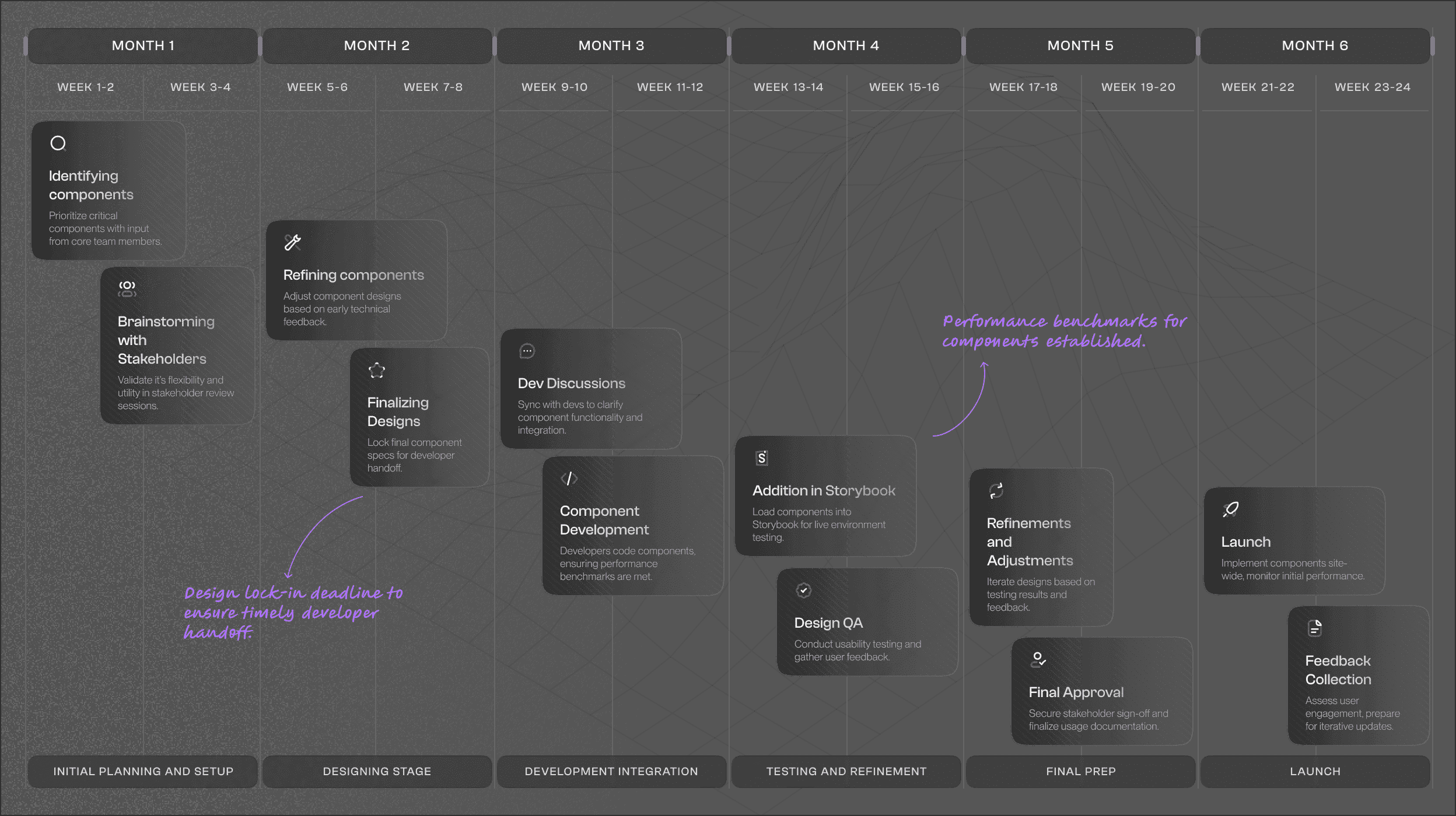
Fig 1. IMAGE
REFINEMENT
Step-by-step process for refining a design system.
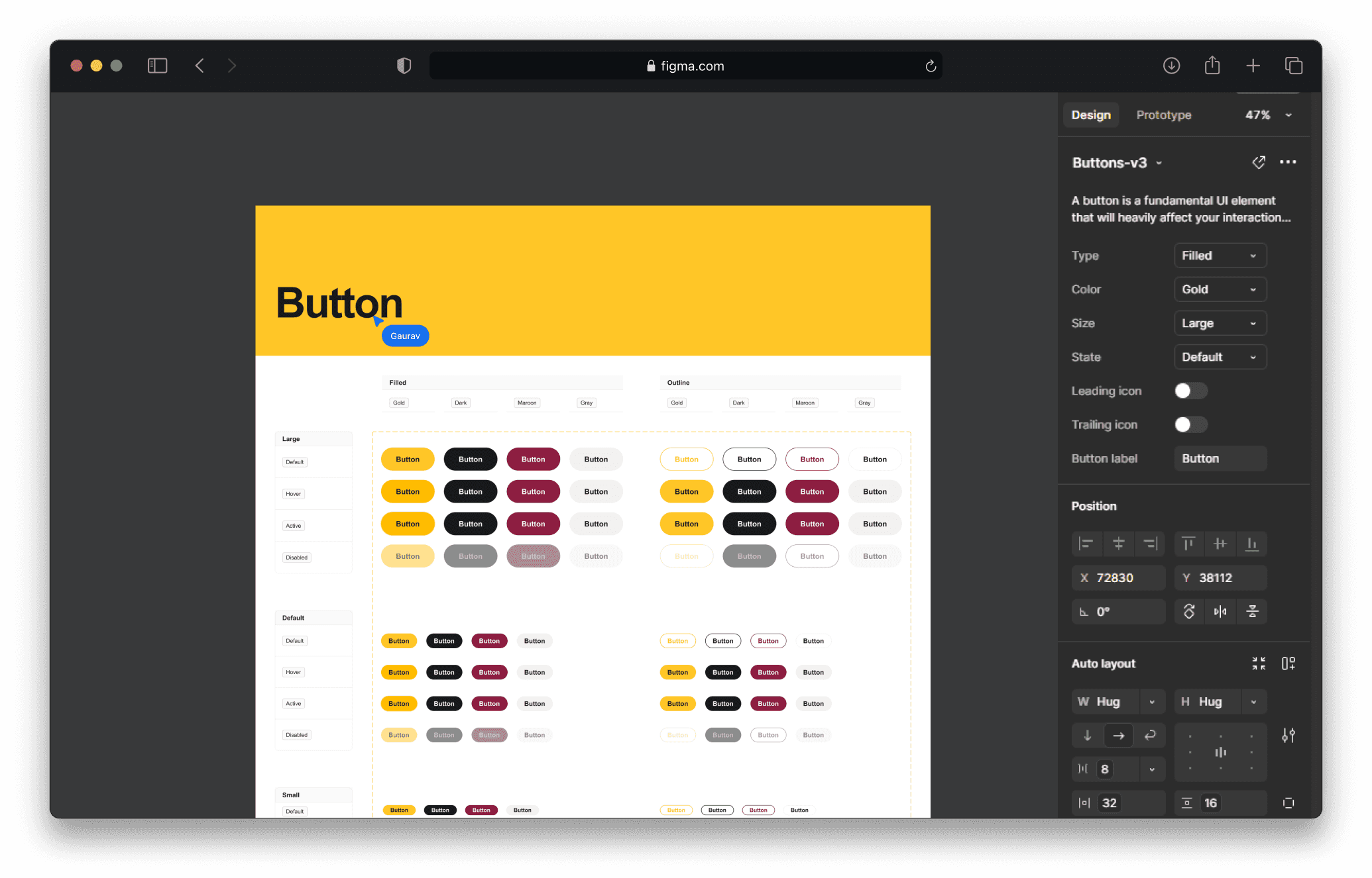
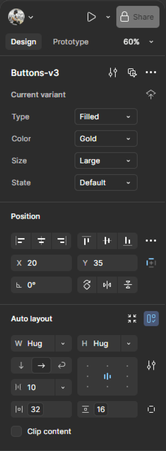
1. Properties
Why?
Designers struggled to customize components after moving from Adobe XD to Figma, slowing prototyping and reducing flexibility.
Solution
We made flexible properties options like , added different sizes, states, included booleans, instances, device, and more.
Results
Designers and developers appreciated the flexibility, as it made components easier to tweak and adapt to different needs.
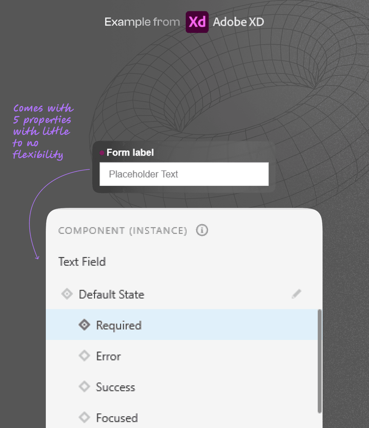
Fig 2. DESIGN IN XD

Fig 3. REFINED IN FIGMA
Fig 1. TEXT INPUT PROPERTIES
2. Variables
Why?
Manually checking design specs from long style guides was slow and caused inconsistencies as projects grew.
Solution
We used variables to automate design standards, applying colors, spacing, and fonts consistently (Fig. 1) while supporting light and dark modes (Fig 2).
Results
This improved brand consistency, saved time, and made designs more adaptable across devices, ensuring a seamless visual experience.

Fig 1. VARIABLES IN RDS
Fig 2. LIGHT AND DARK MODE
3. Responsiveness
Why?
Designers spent too much time manually adjusting layouts for different screen sizes, affecting efficiency and consistency.
Solution
We used Figma’s "Fill", "Hug", device size properties to make components flexible, ensuring they adapt smoothly across devices.
Results
This reduced manual adjustments, improved responsiveness, and kept designs visually consistent on any screen size.
Fig 1. CARD RESPONSIVENESS
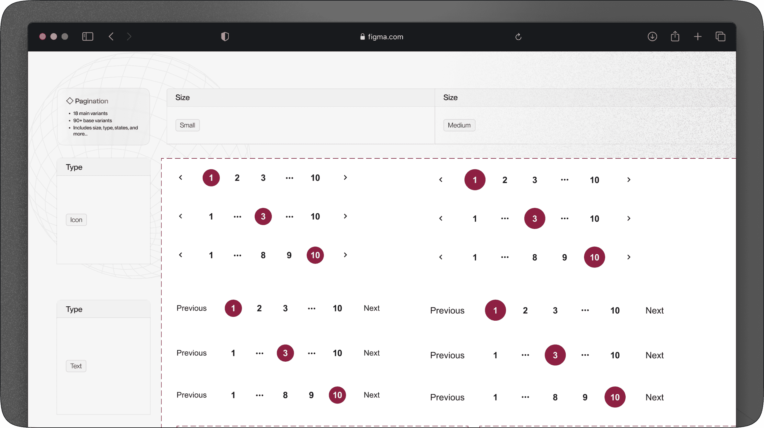
4. Search optimization
Why?
Different teams used varying names for the same components, making searches difficult and slowing down workflows.
Solution
We added tags to component descriptions (Fig. 1), helping designers find what they needed without knowing the exact names.
Results
This improved search efficiency, reduced frustration, and made the design process faster and more intuitive.

Fig 1. SEARCH TAGS
SCALABILITY
Keeping the change manageable
Why?
Updating components with many variants took too much time and effort. Designers had to make the same changes repeatedly.
Solution
We used Atomic design (Fig. 1) to create base and main components—changing the base updates all variants automatically, reducing manual work.
Results
This made updates faster, kept designs consistent, and saved time across the entire design system.
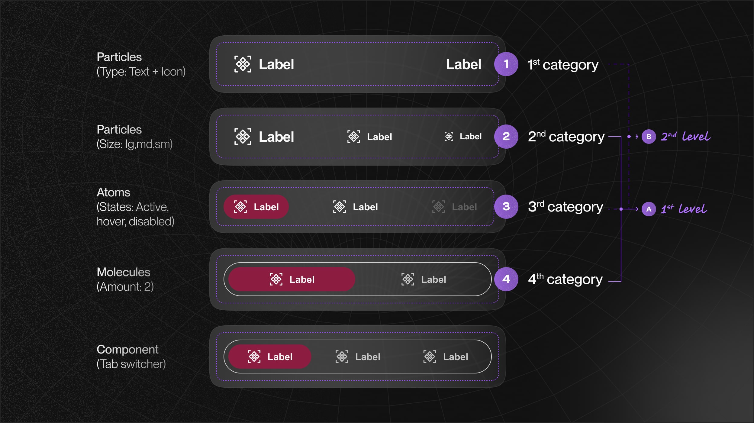
Fig 1. ATOMIC STRUCTURE
MAINTENANCE
Keeping Components Fresh and Consistent
Why?
Without timely updates, components became outdated, causing inconsistencies and extra work for designers and developers.
Solution
We set up biweekly component health checks and documented all updates in Coda (Fig. 1) to keep everything organized.
Results
This kept the design system up to date, reduced inconsistencies, and made collaboration smoother for the entire team.

Fig 1. COMPONENT TRACKER
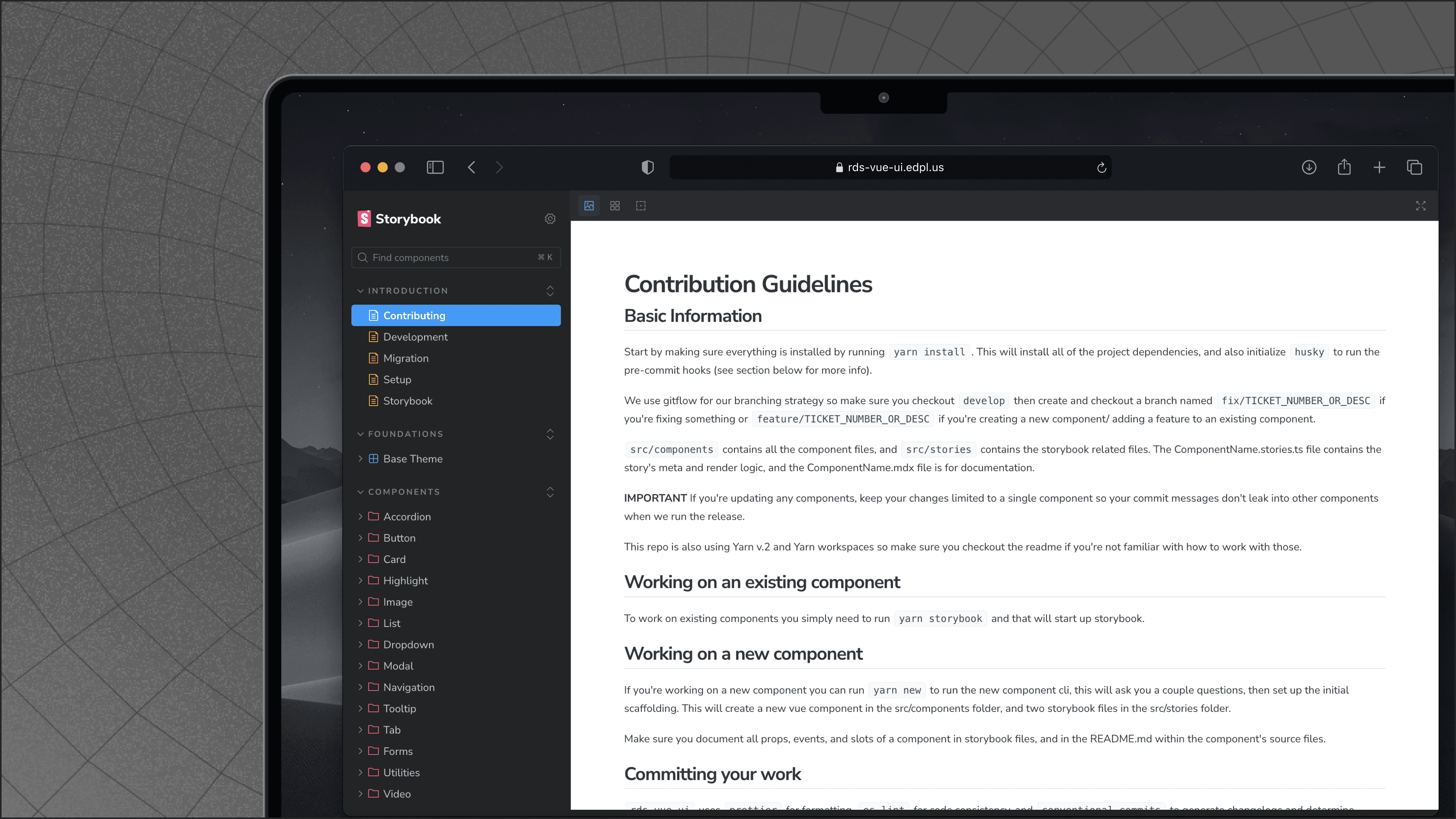
INTEGRATION
Introducing Storybook to the Rocket Design System
Why?
Developers didn’t have a shared component library and reused old components, leading to inconsistent designs. With multiple developers, keeping things aligned was a challenge.
Solution
We added Storybook (Fig. 1), a central place where developers can find code, design references, and documentation for every component.
Results
Now, developers have a ready-to-use component library, making work faster, reducing errors, and keeping designs consistent.

Fig 1. STORYBOOK
Fig 2. FIGMA
Testimonial component in Figma
Testimonial component in Storybook
Fig 2. STORYBOOK
MANAGEMENT
Creating a design to development workflow
Why?
We had a solid plan, but keeping new components up to the same standard was tough. Without a clear process, consistency suffered.
Solution
We built a Component Design-to-Development Flow, a guide designers follow whenever a new request comes in.
Results
This made the workflow smoother, kept quality high, and ensured the design system stayed consistent as it grew.
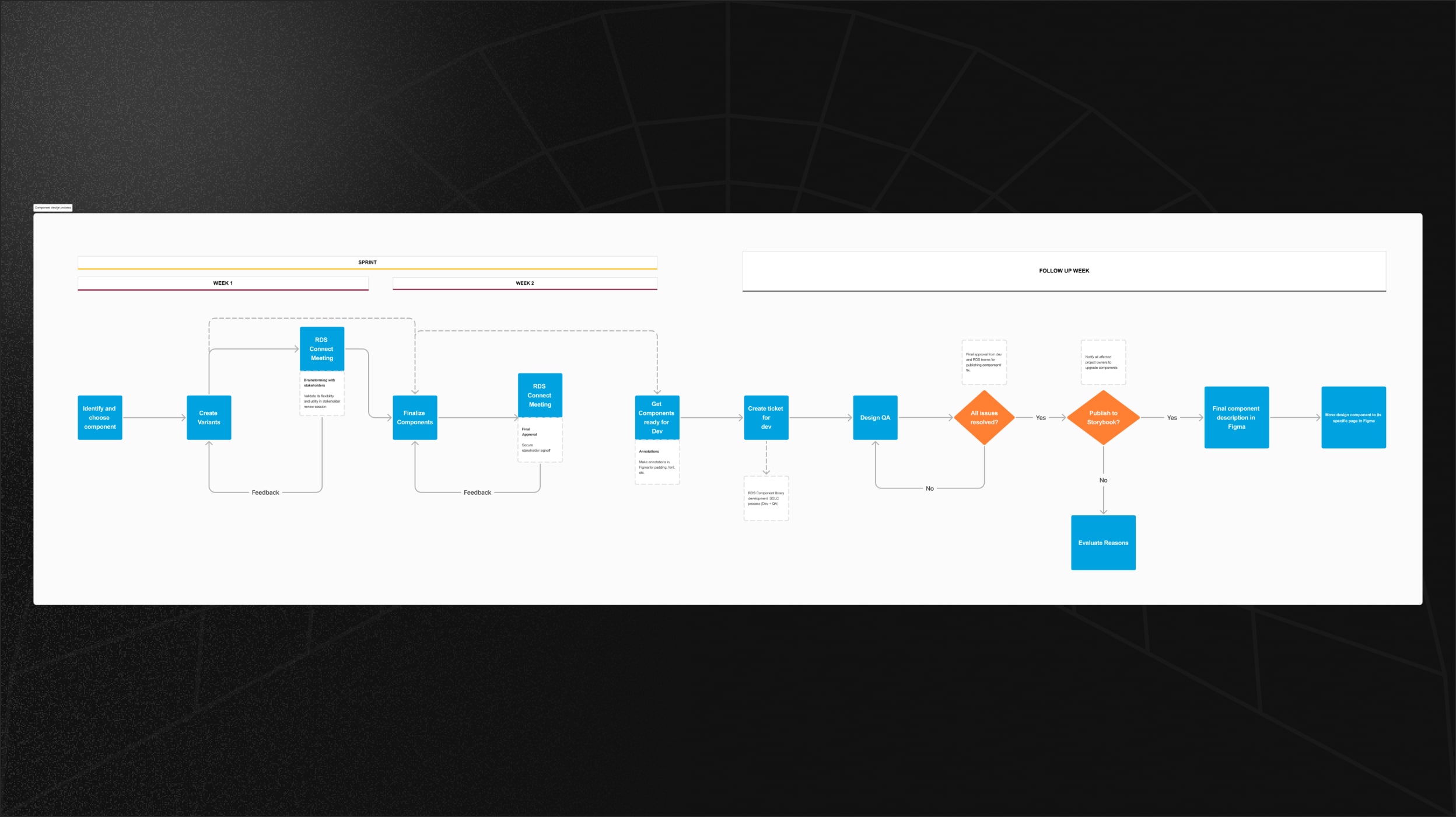
Fig 1. COMPONENT DESIGN FLOW

Fig 2. COMPONENT DEVELOPMENT FLOW
IMPACT
What did we achieve?

Key Learnings
Process is just as important as the product
Moving on, I’ll define the process first. A clear process early on ensures smoother collaboration, consistency, and efficiency as the project scales.
Scalability starts early
Using base and main components ensured that updates flowed smoothly across all variants, reducing repetitive work and improving efficiency.
User feedback
It allowed me for continuous refinement of components, helping to better meet user needs and improve overall satisfaction and engagement.
up


Rocket Design system
EDPLUS
MARCH 2024
Overview
RDS is a centralized design system developed by the product design team for ASU Online to support the diverse and expanding needs of more than 100,000 users.
The main goal of this project was to rebuild and refine a strong design system for our web and mobile applications, focusing on scalability, maintainability, responsiveness, and front-end development.
My Role
Product Designer — Interaction Design, Visual Design, Design Systems, Rapid Prototyping
Timeline
6 months, Updated as of September 2024. Live link
Team
Jeroel Padilla, UX Lead
Patrick Byrn, SWE Lead
Vijayasimhan Ganesan, SWE
Kendall Slaughter, Director of Design and Creative Services


HIGHLIGHTS
An end-to-end organized, scalable, responsive design systemthat translates to actual code.
HIGHLIGHTS
CONTEXT
With multiple dev teams—some in-house, some offshore—our product started feeling disjointed. Developers built pages based on design files, but without a shared system, things looked different everywhere.
We transitioned from XD to Figma, hoping for a smoother workflow, but the shift exposed deeper issues. Instead of just migrating files, we refined our entire design system to bring clarity, and speed up development.
PROBLEM
Core problems:
The shift created inconsistencies between design, and development. These misalignments led to confusion, wasted effort, and inconsistent user experiences.
Different teams were producing designs that didn’t align, leading to a fragmented user experience across platforms.
Keeping the design system updated was a slow and cumbersome process and tough to integrate new standards.
As ASU Online grew, our existing components struggled to keep up, causing delays and adding to the workload.
There was a disconnect between design and development workflows, which seriously impacted efficiency and consistency of the final product.
GOAL
Identified goals:
To improve the Rocket Design System for ASU Online by making the design process clear, refining components for consistency, and working closely with developers.
For next step we created a timeline for this project.
Refinement: Create a shared design system for all ASU Online teams to keep designs consistent.
Scalability: Use atomic design so small changes update all components easily.
Maintenance: Check component health every two weeks and document updates in Coda.
Integration: Use Storybook to make developer collaboration easier and improve workflow.
REFINEMENT
Step-by-step process for refining a design system.
1. Properties
Why?
Designers struggled to customize components after moving from Adobe XD to Figma, slowing prototyping and reducing flexibility.
Solution
We made flexible properties options like , added different sizes, states, included booleans, instances, device, and more.
Results
Designers and developers appreciated the flexibility, as it made components easier to tweak and adapt to different needs.
2. Variables
Why?
Manually checking design specs from long style guides was slow and caused inconsistencies as projects grew.
Solution
We used variables to automate design standards, applying colors, spacing, and fonts consistently while supporting light and dark modes.
Results
This improved brand consistency, saved time, and made designs more adaptable across devices, ensuring a seamless visual experience.
3. Responsiveness
Why?
Designers spent too much time manually adjusting layouts for different screen sizes, affecting efficiency and consistency.
Solution
We used Figma’s "Fill", "Hug", device size properties to make components flexible, ensuring they adapt smoothly across devices.
Results
This reduced manual adjustments, improved responsiveness, and kept designs visually consistent on any screen size.

4. Search optimization
Why?
Different teams used varying names for the same components, making searches difficult and slowing down workflows.
Solution
We added tags to component descriptions (Fig. 1), helping designers find what they needed without knowing the exact names.
Results
This improved search efficiency, reduced frustration, and made the design process faster and more intuitive.
SCALABILITY
Keeping the change manageable
Why?
Updating components with many variants took too much time and effort. Designers had to make the same changes repeatedly.
Solution
We used Atomic design to create base and main components—changing the base updates all variants automatically, reducing manual work.
Results
This made updates faster, kept designs consistent, and saved time across the entire design system.
INTEGRATION
Introducing Storybook to the Rocket Design System
Why?
Developers didn’t have a shared component library and reused old components, leading to inconsistent designs. With multiple developers, keeping things aligned was a challenge.
Solution
We added Storybook, a central place where developers can find code, design references, and documentation for every component.
Results
Now, developers have a ready-to-use component library, making work faster, reducing errors, and keeping designs consistent.
Testimonial component in Figma
Testimonial component in Storybook
MAINTENANCE
Keeping Components Fresh and Consistent
Why?
Without timely updates, components became outdated, causing inconsistencies and extra work for designers and developers.
Solution
We set up biweekly component health checks and documented all updates in Coda (Fig. 1) to keep everything organized.
Results
This kept the design system up to date, reduced inconsistencies, and made collaboration smoother for the entire team.
INTEGRATION
Introducing Storybook to the Rocket Design System
Why?
Without timely updates, components became outdated, causing inconsistencies and extra work for designers and developers.
Solution
We set up biweekly component health checks and documented all updates in Coda (Fig. 1) to keep everything organized.
Results
This kept the design system up to date, reduced inconsistencies, and made collaboration smoother for the entire team.
MANAGEMENT
Creating a design to development workflow
Why?
We had a solid plan, but keeping new components up to the same standard was tough. Without a clear process, consistency suffered.
Solution
We built a Component Design-to-Development Flow, a guide designers follow whenever a new request comes in.
Results
This made the workflow smoother, kept quality high, and ensured the design system stayed consistent as it grew.

IMPACT
What did we achieve?
Key Learnings
Proactive problem solving
Anticipating potential issues and addressing them before they become significant problems was key.
Importance of communication
It taught me that if stakeholders stays aligned with the same vision, it leads to a more cohesive and efficient workflow.
User feedback
It allowed me for continuous refinement of components, helping to better meet user needs and improve overall satisfaction and engagement.
up

Rocket Design system
EDPLUS
MARCH 2024
Overview
RDS is a centralized design system developed by the product design team for ASU Online to support the diverse and expanding needs of more than 100,000 users.
The main goal of this project was to rebuild and refine a strong design system for our web and mobile applications, focusing on scalability, maintainability, responsiveness, and front-end development.
My Role
Product Designer — Interaction Design, Visual Design, Design Systems, Rapid Prototyping
Timeline
6 months, Updated as of September 2024. Live link
Team
Jeroel Padilla, UX Lead
Patrick Byrn, SWE Lead
Vijayasimhan Ganesan, SWE
Kendall Slaughter, Director of Design and Creative Services
HIGHLIGHTS
An end-to-end organized, scalable, responsive design system that translates to actual code.
HIGHLIGHTS

VIDEO LOOP

VIDEO LOOP
VIDEO LOOP
VIDEO LOOP
CONTEXT
With multiple dev teams—some in-house, some offshore—our product started feeling disjointed. Developers built pages based on design files, but without a shared system, things looked different everywhere.
We transitioned from XD to Figma, hoping for a smoother workflow, but the shift exposed deeper issues. Instead of just migrating files, we refined our entire design system to bring clarity, and speed up development.
PROBLEM
Core problems:
The shift created inconsistencies between design, and development. These misalignments led to confusion, wasted effort, and inconsistent user experiences.
Different teams were producing designs that didn’t align, leading to a fragmented user experience across platforms.
Keeping the design system updated was a slow and cumbersome process and tough to integrate new standards.
As ASU Online grew, our existing components struggled to keep up, causing delays and adding to the workload.
There was a disconnect between design and development workflows, which seriously impacted efficiency and consistency of the final product.
GOAL
Setting a new standard in design system work flow
Identified goals:
To improve the Rocket Design System for ASU Online by making the design process clear, refining components for consistency, and working closely with developers.
For next step we created a timeline for this project.
Refinement: Create a shared design system for all ASU Online teams to keep designs consistent.
Scalability: Use atomic design so small changes update all components easily.
Maintenance: Check component health every two weeks and document updates in Coda.
Integration: Use Storybook to make developer collaboration easier and improve workflow.
REFINEMENT
Step-by-step process for refining a design system.
1. Properties
Why?
Designers struggled to customize components after moving from Adobe XD to Figma, slowing prototyping and reducing flexibility.
Solution
We made flexible properties options like , added different sizes, states, included booleans, instances, device, and more.
Results
Designers and developers appreciated the flexibility, as it made components easier to tweak and adapt to different needs.
2. Variables
Why?
Manually checking design specs from long style guides was slow and caused inconsistencies as projects grew.
Solution
We used variables to automate design standards, applying colors, spacing, and fonts consistently while supporting light and dark modes.
Results
This improved brand consistency, saved time, and made designs more adaptable across devices, ensuring a seamless visual experience.
3. Responsiveness
Why?
Designers spent too much time manually adjusting layouts for different screen sizes, affecting efficiency and consistency.
Solution
We used Figma’s "Fill", "Hug", device size properties to make components flexible, ensuring they adapt smoothly across devices.
Results
This reduced manual adjustments, improved responsiveness, and kept designs visually consistent on any screen size.
4. Search optimization
Why?
Different teams used varying names for the same components, making searches difficult and slowing down workflows.
Solution
We added tags to component descriptions (Fig. 1), helping designers find what they needed without knowing the exact names.
Results
This improved search efficiency, reduced frustration, and made the design process faster and more intuitive.
SCALABILITY
Keeping the change manageable
Why?
Updating components with many variants took too much time and effort. Designers had to make the same changes repeatedly.
Solution
We used Atomic design to create base and main components—changing the base updates all variants automatically, reducing manual work.
Results
This made updates faster, kept designs consistent, and saved time across the entire design system.
Lorem ipsum dolor sit amet,
When I first joined the EdPlus team as a UX designer focused on design systems, we were working with components that had been imported from Adobe XD. But when these elements were brought into Figma, the transition didn’t always go smoothly.
I streamlined our workflow and improved the alignment between design and development.
MAINTENANCE
Lorem ipsum dolor sit amet,
When I first joined the EdPlus team as a UX designer focused on design systems, we were working with components that had been imported from Adobe XD. But when these elements were brought into Figma, the transition didn’t always go smoothly.
I streamlined our workflow and improved the alignment between design and development.
Keeping components fresh and consistent
Why?
Updating components with many variants took too much time and effort. Designers had to make the same changes repeatedly.
Solution
We used Atomic design to create base and main components—changing the base updates all variants automatically, reducing manual work.
Results
This made updates faster, kept designs consistent, and saved time across the entire design system.
INTEGRATION
The challenge of disconnected tools
Why?
Developers didn’t have a shared component library and reused old components, leading to inconsistent designs. With multiple developers, keeping things aligned was a challenge.
Solution
We added Storybook, a central place where developers can find code, design references, and documentation for every component.
Results
Now, developers have a ready-to-use component library, making work faster, reducing errors, and keeping designs consistent.
Testimonial component in Figma
Testimonial component in Storybook
MANAGEMENT
Creating a design to development workflow
Why?
We had a solid plan, but keeping new components up to the same standard was tough. Without a clear process, consistency suffered.
Solution
We built a Component Design-to-Development Flow, a guide designers follow whenever a new request comes in.
Results
This made the workflow smoother, kept quality high, and ensured the design system stayed consistent as it grew.
IMPACT
What did we achieve?
Key Learnings
Process is just as important as the product
Moving on, I’ll define the process first. A clear process early on ensures smoother collaboration, consistency, and efficiency as the project scales.
Scalability starts early
Using base and main components ensured that updates flowed smoothly across all variants, reducing repetitive work and improving efficiency.
User feedback
It allowed me for continuous refinement of components, helping to better meet user needs and improve overall satisfaction and engagement.


up