Reducing development time by 62.5% by launching a design system

Reducing development time by 62.5% by launching a design system

Role

UX Designer, Design Systems

Team

Jeroel Padilla, Lead UX Designer

Patrick Byrn, SWE Lead

Vijayasimhan Ganesan, SWE

Kendall Slaughter, Design Director

Skills

Design Systems

Interaction Design

Prototyping

Timeline

6 months

Overview

Overview

Building a fully digital personal loan flow

Building a fully digital personal loan flow

At Bajaj Finance, I redesigned the personal loan feature within the app, shifting it from a lead-generation funnel to a fully digital lending journey. Users could now apply, upload documents, verify identity, and track approvals entirely in-app.

This reduced dependency on phone calls, lowered operational effort, and created a scalable foundation for rural personal loan growth.

Problem

Problem

When a design system fails to scale across teams

When a design system fails to scale across teams

As ASU Online scaled and transitioned from XD to Figma, the existing design system began to break down. Components migrated directly from XD began to behave unpredictably in Figma, making them difficult to resize, manage states, and reuse reliably.

As ASU Online scaled and transitioned from XD to Figma, the existing design system began to break down. Components migrated directly from XD began to behave unpredictably in Figma, making them difficult to resize, manage states, and reuse reliably.

Discovery insights

Discovery insights

Root causes behind workflow slowdowns

Root causes behind workflow slowdowns

To understand where the system was breaking down, we gathered feedback from designers, product managers, and developers following the XD to Figma migration.

To understand where the system was breaking down, we gathered feedback from designers, product managers, and developers following the XD to Figma migration.

What we discovered

What we discovered

USABILITY OVER AVAILABILITY

Migrated components existed, but broken instances, unreliable states, and structure made them unusable at scale.

Migrated components existed, but unreliable resizing, states, and structure made them unusable at scale.

Migrated components existed, but unreliable resizing, states, and structure made them unusable at scale.

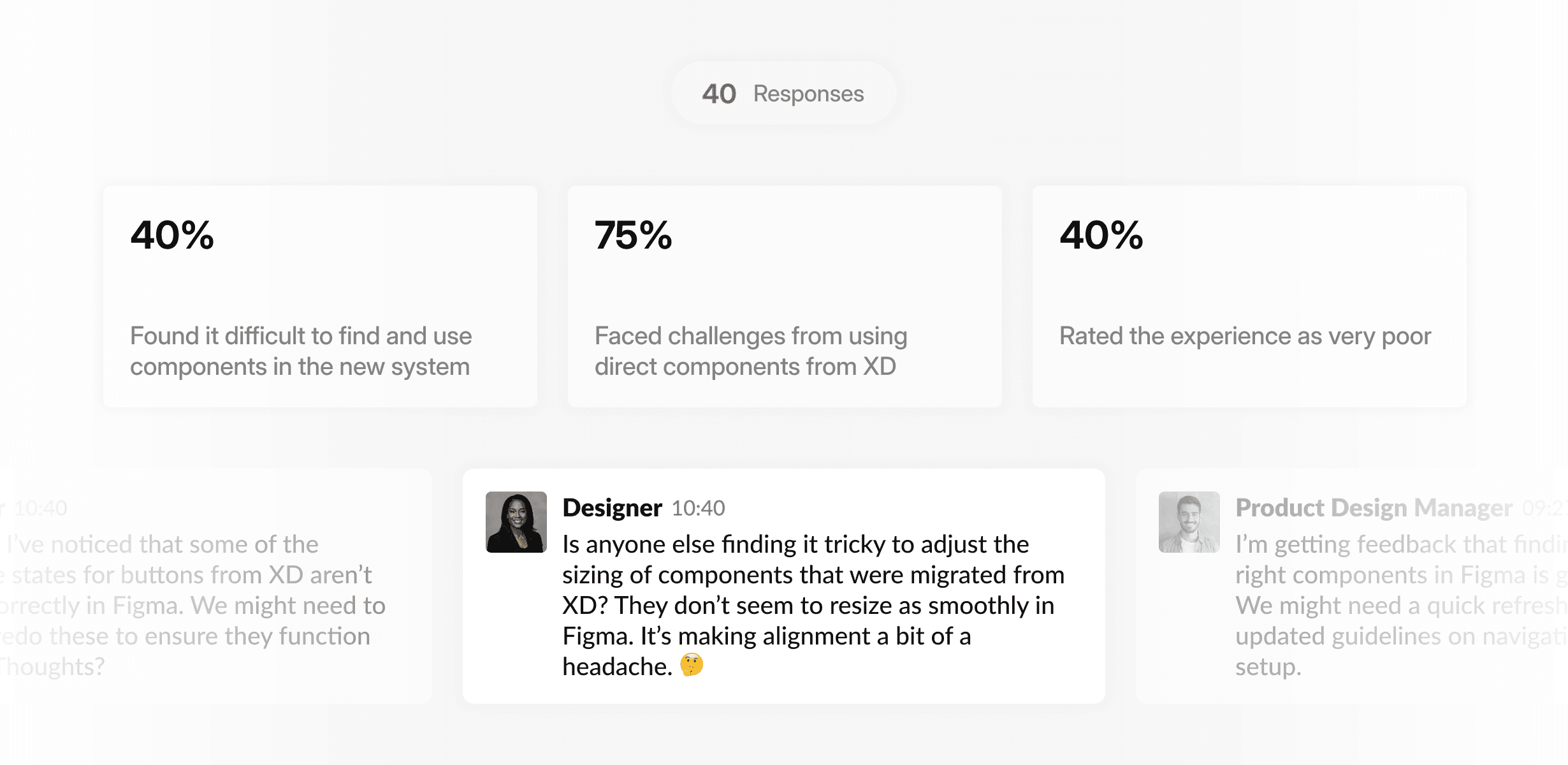
MISSING SYSTEM GOVERNANCE

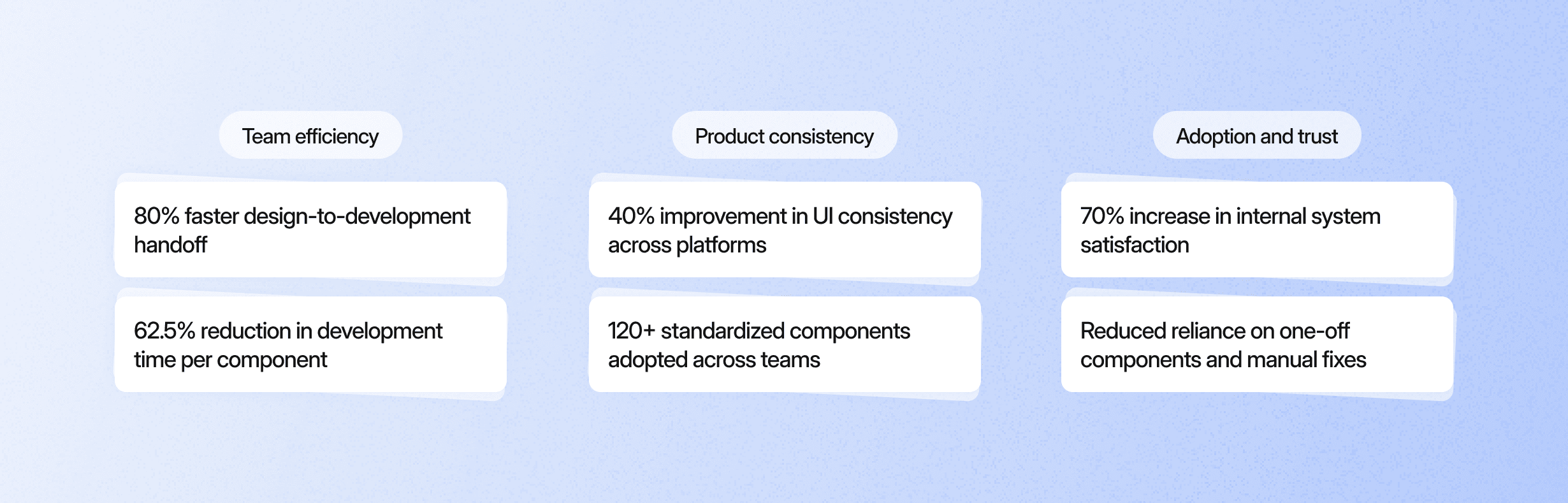
Without ownership and standards, teams relied on manual fixes, increasing inconsistency across products.

BRITTLE AT SCALE

As more teams shipped simultaneously, maintenance overhead and error rates grew non-linearly.

Strategy and key decisions

Strategy and key decisions

Designing for scale, governance, and reuse

Designing for scale, governance, and reuse

Based on discovery, we defined a clear set of system principles focused on scalability, governance, and long-term reuse across teams.

Based on discovery, we defined a clear set of system principles focused on scalability, governance, and long-term reuse across teams.

Usability over availability

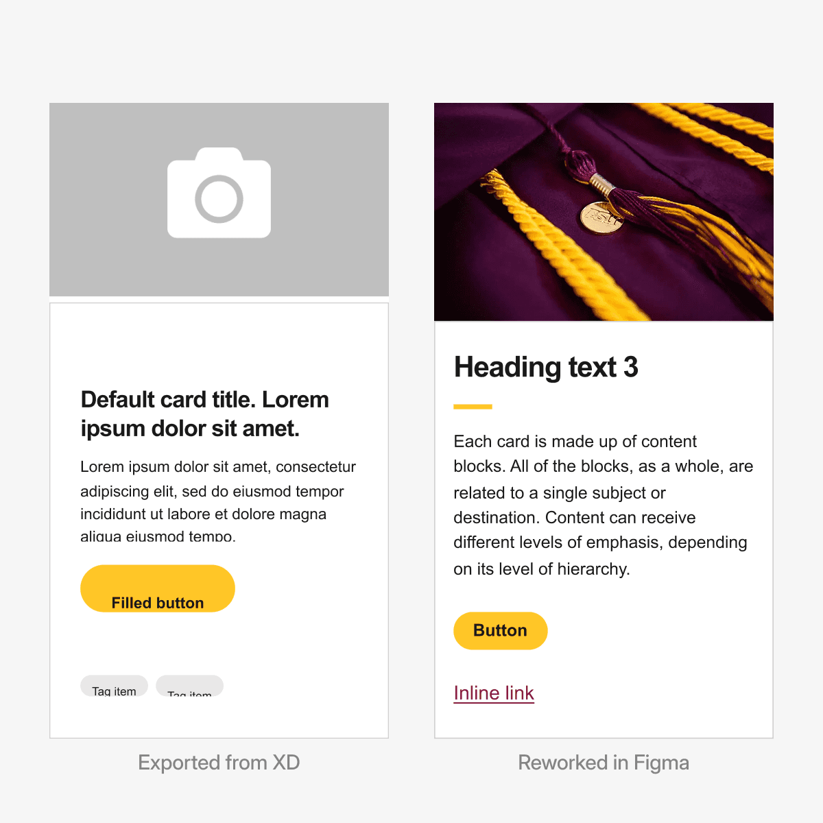
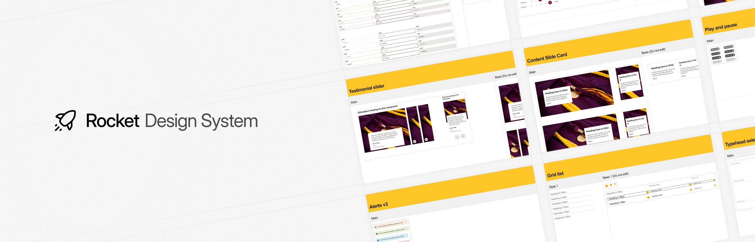
We rebuilt a smaller set of high-impact components that resized reliably, supported clear states, and were easy to reuse.

WHY

Prevented repeating the XD migration failure where components existed but were unusable at scale.

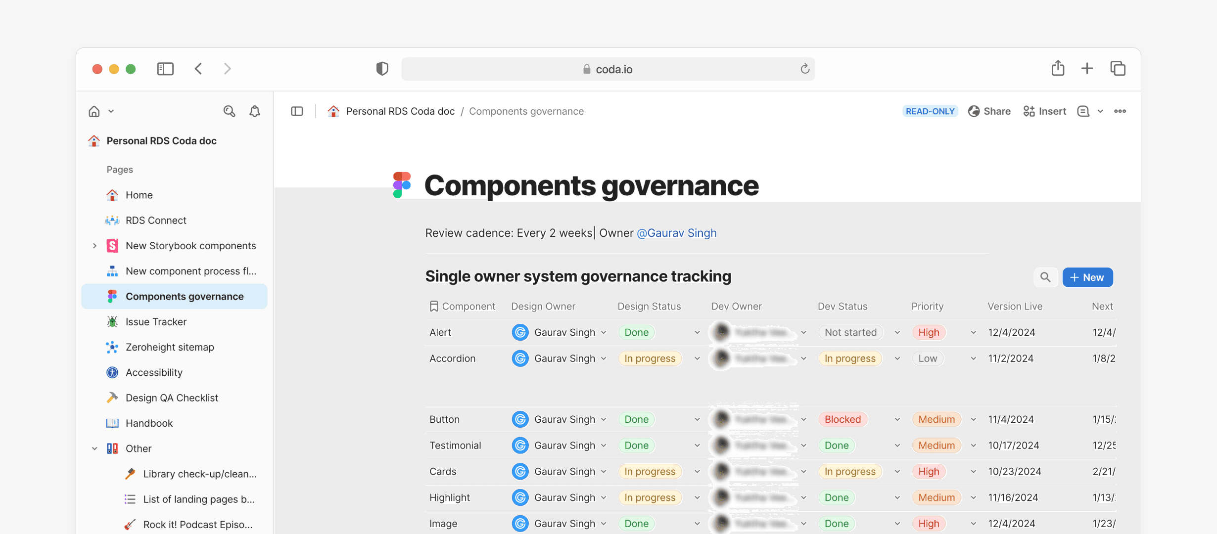
Establish shared system governance

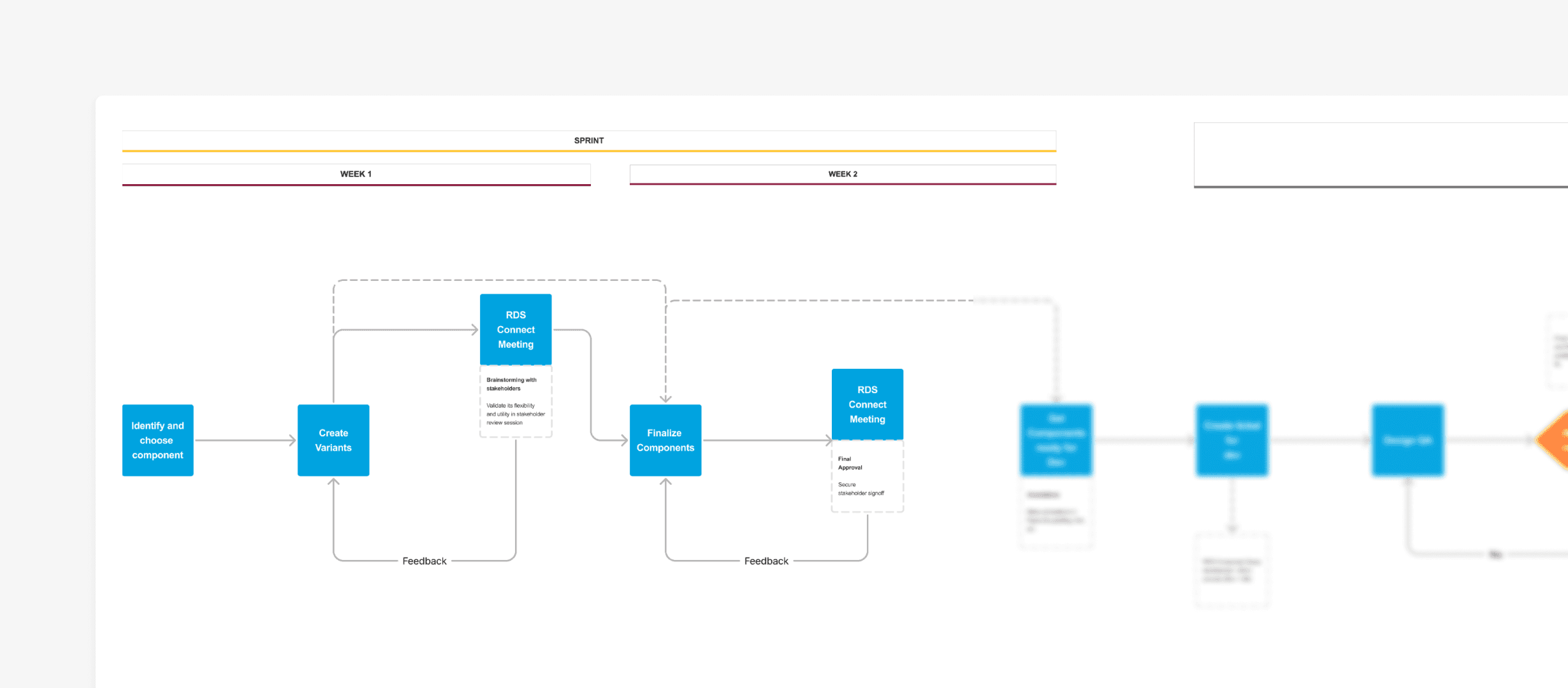
We defined clear ownership, review standards, and update rituals to keep design and the development aligned.

WHY

Reduced design–code drift and eliminated repeated manual fixes across teams.

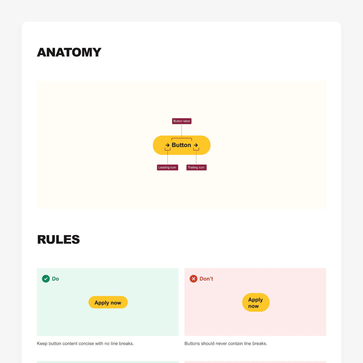
Design components to scale safely

Components were rebuilt as scalable primitives so small changes could propagate without breaking downstream usage.

WHY

Enabled multiple teams to ship in parallel without making the system brittle or error-prone.

Tighten design–development feedback loops

Designers and developers aligned early on component behavior and constraints to reduce rework and late-stage fixes.

WHY

Surfaced technical constraints early, reduced rework, and increased trust in the system.

Solutions

Solutions

Rebuilding the system for scale, reliability, and reuse

Rebuilding the system for scale, reliability, and reuse

To address the core failures uncovered in discovery, we focused on rebuilding foundational component behaviors rather than incrementally fixing individual issues.

To address the core failures uncovered in discovery, we focused on rebuilding foundational component behaviors rather than incrementally fixing individual issues.

Flexible component configuration

Flexible component configuration

Core components were rebuilt with flexible properties, variants, and states to support real-world customization without breaking structure.

Core components were rebuilt with flexible properties, variants, and states to support real-world customization without breaking structure.

WHY

Improves component usability while preventing ad-hoc overrides that reduce consistency at scale.

Systemized variables and tokens

Systemized variables and tokens

Color, spacing, and typography were abstracted into shared variables, enabling consistent application across components and supporting light and dark modes.

Color, spacing, and typography were abstracted into shared variables, enabling consistent application across components and supporting light and dark modes.

WHY

Ensures visual consistency and allows system-wide updates without manual rework.

Responsive-by-default components

Responsive-by-default components

Components were designed using flexible layout behaviors, so they adapt predictably across screen sizes.

Components were designed using flexible layout behaviors, so they adapt predictably across screen sizes.

WHY

Reduces manual resizing and ensures layouts remain consistent across devices.

Findability and reuse at scale

Findability and reuse at scale

Components were documented with clear naming, descriptions, and tags to make discovery easier across teams.

Components were documented with clear naming, descriptions, and tags to make discovery easier across teams.

WHY

Improves adoption and prevents duplicate or inconsistent component creation.

Scalable component architecture

Scalable component architecture

Components were structured using atomic principles so updates to base elements propagate safely across all variants.

Components were structured using atomic principles so updates to base elements propagate safely across all variants.

WHY

Keeps maintenance manageable as the system grows and multiple teams ship in parallel.
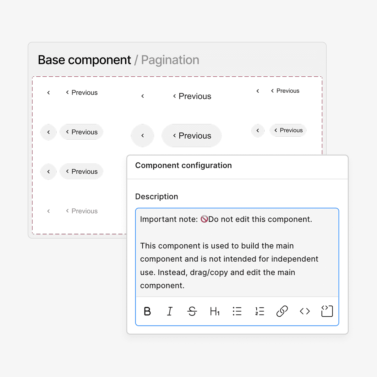
Integration

Integration

Bridging design and development workflows through Storybook

Bridging design and development workflows through Storybook

As the system scaled, components needed to behave consistently across design and production to prevent drift and rework.

As the system scaled, components needed to behave consistently across design and production to prevent drift and rework.

Component in Figma

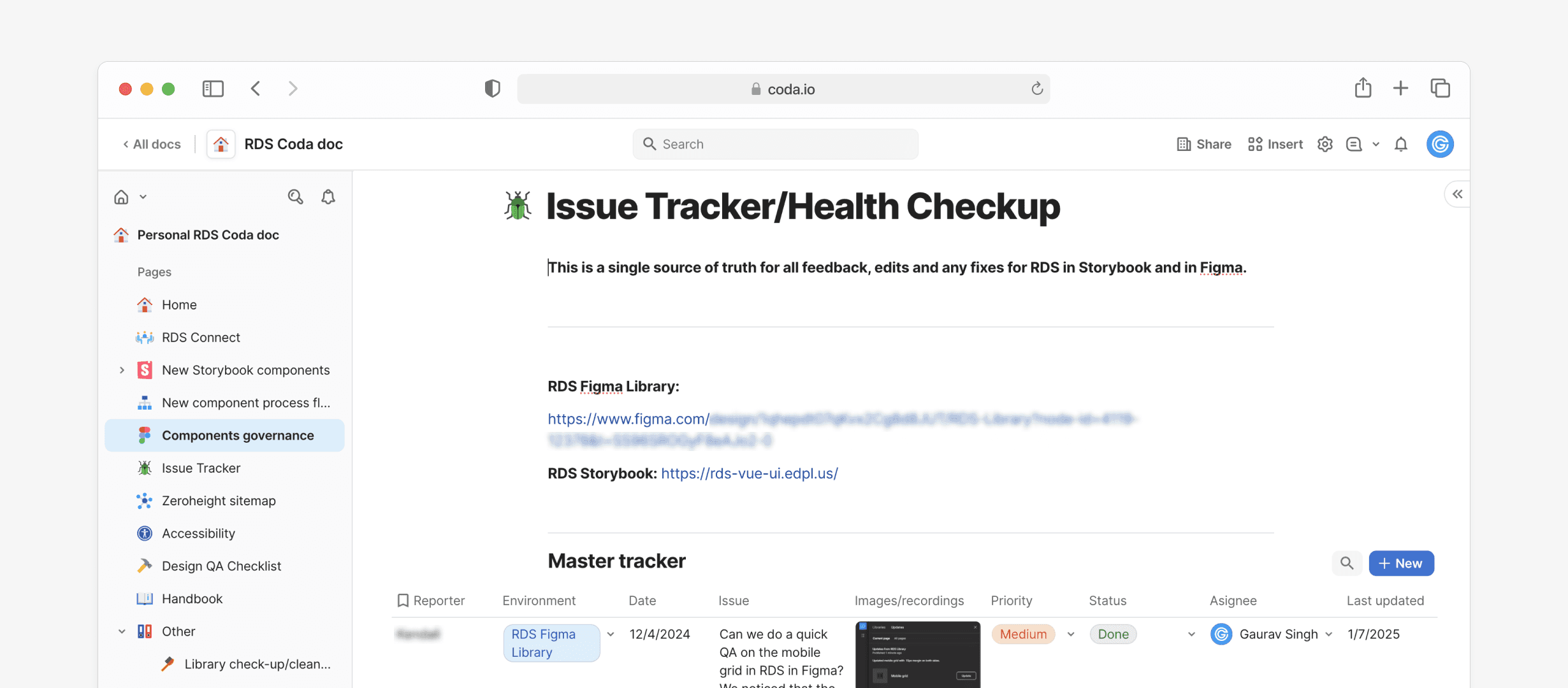
Component in Storybook

We integrated the design system into Storybook, giving developers a single, reliable source for component code, design references, and documentation.

We integrated the design system into Storybook, giving developers a single, reliable source for component code, design references, and documentation.

WHY

Improved design–development parity, reduced implementation errors, and increased confidence in reusing system components.

System Governance

System Governance

How the system stays consistent after launch

How the system stays consistent after launch

Designing the system was only part of the work. We also defined how components are reviewed, maintained, and evolved as teams scale.

Designing the system was only part of the work. We also defined how components are reviewed, maintained, and evolved as teams scale.

Design-to-development workflow

Design-to-development workflow

We established a standardized design-to-development flow that designers followed for every new component request, from definition through handoff.

We established a standardized design-to-development flow that designers followed for every new component request, from definition through handoff.

WHY

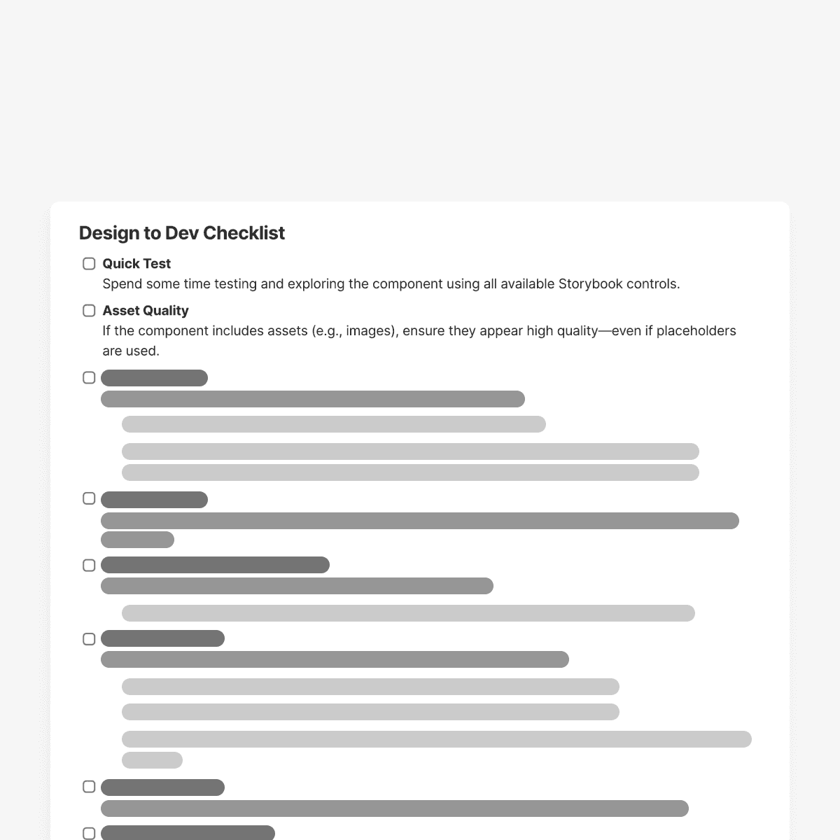
This ensured new components met system standards and reduced variation as the system grew.

Component health checks

Component health checks

We introduced biweekly component health checks and tracked all issues, fixes, and updates in a shared Coda tracker to maintain a single source of truth.

We introduced biweekly component health checks and tracked all issues, fixes, and updates in a shared Coda tracker to maintain a single source of truth.

WHY

This kept the system reliable over time and reduced recurring cleanup work for designers and developers.

Ownership and review cadence

Ownership and review cadence

We defined clear ownership, review checkpoints, and lock-in points to align designers and developers before implementation.

We defined clear ownership, review checkpoints, and lock-in points to align designers and developers before implementation.

WHY

This surfaced constraints early, reduced rework, and increased trust in the system.

Impact

Impact

Learnings

Learnings

EARLY DECISIONS COMPOUND QUICKLY

Small foundational choices had outsized impact once multiple teams began shipping in parallel.

CLARITY ENABLES SPEED

Teams moved faster when expectations, constraints, and decision ownership were explicit upfront.

You can connect with me through

Made with ♡ & coffee chai.

Get in touch on

© Gaurav Singh

4:12:29 AM

You can connect with me through

Get in touch on

© Gaurav Singh

4:12:29 AM

Made with ♡ & coffee chai.

You can connect with me through

Made with ♡ & coffee chai.

Get in touch on

© Gaurav Singh

4:12:29 AM